

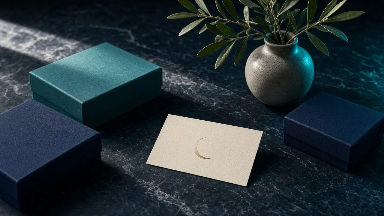
Maysan Health identity
A calm, clinical brand system for a regional healthcare network.
Maysan needed to feel trustworthy without feeling cold. We rebuilt the identity around a soft geometric mark, a clinical-but-warm palette and a typographic system that survives Arabic and English side by side.


Have a similar project?
Tell us the goal, and we’ll return with a clear first-phase plan.
Get in touch