

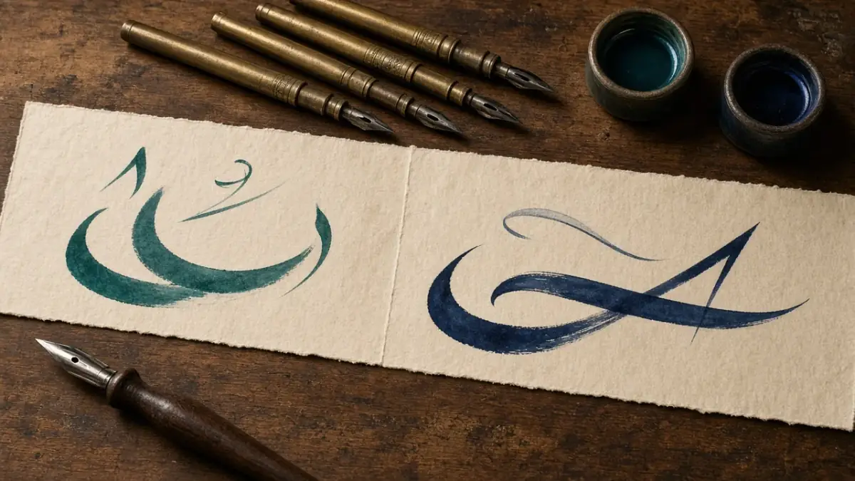
A logo is the smallest part of the system
The mark is what people recognise. The system is what they remember: type, colour, voice, and the way a brand behaves when the logo is not in the centre of the frame.
Read more
When a brand says it is bilingual, it often means the copy will be translated at the end. The intention is kind, and it is not enough. An Arabic experience is made in the typeface, the width of a button, the way a heading breaks, and the direction of motion on the page. If those decisions are designed for English first, Arabic is pasted on afterwards — and the result feels second-class, even when the translation is careful.
In our work with brands that speak to Arabic and international audiences at once, we treat both languages as one system, not as two consecutive versions. The goal is not literal visual sameness. It is fairness: an Arabic reader should feel the interface was written for them, not borrowed from another language.
Grand intentions are rarely the problem. The problem shows up as a headline overflowing a card, a menu that breaks awkwardly, or a form field too narrow for naturally longer Arabic words. It shows up in icons drawn to be read from the left, and in campaign photography that already contains English lettering while the page itself is Arabic.
Those details add up to a feeling that Arabic is a guest. A visitor may not use that word, but they feel that reading is heavier, the page is less considered, and trust is weaker than the identity promised. When the same details are handled from the start, bilingual design becomes an advantage: the brand can stand in two markets without betraying either.
Arabic is not a liquid you pour into a grid designed for English. If the system cannot hold word length and reading direction, the fault is in the system, not in the language.
Before we open the first set of screens, we write a short language contract: the typefaces, their weights, the scale for headings and body, the rules for numbers and dates, and which components flip in RTL and which stay put. That contract saves weeks of late debate, because it turns taste into a shared decision the team can return to.
A good bilingual grid is not the tightest or the loosest. It is the one most tolerant of changing copy length. An Arabic heading that fits on one line in a mock may need two, and a short English button can look stranded if it was sized for a long Arabic phrase. So we test components with real copy in both languages, not with short dummy strings.
We leave margins that allow a generous break, and we avoid containers locked to a single word’s width. On cards and lists we prefer a flexible minimum height over cutting meaning off. Language is not decoration to be trimmed to fit; the container should learn to make room.
Pairing an Arabic typeface with a Latin one is a design problem, not a quick search. Visual weight, letter height, contrast, and how marks behave if they appear at all: each of these shapes the feeling of the brand. A heavy Arabic face beside a thin Latin one makes a page look assembled from two families that are not speaking.
We set a clear scale — display, second heading, body, caption, and a small descriptive size — then we review that scale in both languages on the same screen. A size that feels balanced in one language can feel timid or loud in the other. The aim is a shared rhythm, not a Latin specimen copied across.
The worst moment in a bilingual project is the sentence “design is done, start translating.” That is when we discover headings that will not break, calls to action that have become full sentences, and legal passages that cannot live in the column. The fix is not to pressure the translator. It is to bring writing to the design table early.
When writer and designer work together, sentence length becomes a shared decision. We may recast an Arabic title so it is stronger and shorter, or widen a card because the English line needs more breath. That negotiation is the real design work, not arranging layers after it is too late.
The method does not need heavy process. It needs an order that protects the team from rework. This is the sequence we return to whenever a project must speak Arabic and English, whether in one interface or in two parallel sites.
These steps do not replace taste. They stop taste from remaining private. When a new designer on the team can open the guide and find an answer about numbers or menu behaviour, the system has started to work.
A design file hides many problems because it shows a best case. Real testing happens on a real phone, with a real reader, in daylight, sometimes on a slow connection. We ask Arabic readers and English readers to complete the same task: find a price, understand a service, or finish a contact step.
We watch where they hesitate, where the copy feels tight, and where direction feels unnatural. Simple notes of this kind are worth more than long comment rounds on colour. After launch we stay ready to adjust spacing and headings; bilingual work is not a project that closes on delivery day.
A brand that speaks to two markets deserves to be designed twice at the same time, not once and then translated. That is not inefficiency. It is respect for the reader. When the small decisions are complete, the page stops apologising and starts to persuade.
If you are rebuilding a site or a product so Arabic and English are treated fairly, we would be glad to review the current experience and set a clear system for the next step. Talk to us, and we will start from real content rather than general promises.

Head of Design
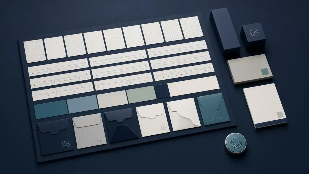
The mark is what people recognise. The system is what they remember: type, colour, voice, and the way a brand behaves when the logo is not in the centre of the frame.

A pricing page fails when packages are invented in a sales deck and then decorated by design. Treat it as a product surface: offer, proof, and a calm path to choose.
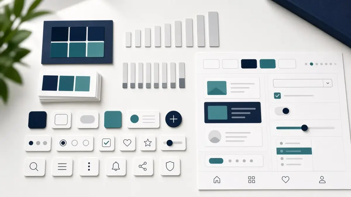
A Figma file full of components is not a system until it changes how a team decides. Here is the difference, and how we build something people actually use.
We will review your site or campaign and build a clear plan for the next step.