


Research before design, always
The cheapest hour in a project is the one spent not designing the wrong thing. A short, honest inquiry — even in a tight timeline — changes what gets built.
Read more
A pricing page is not three rectangles with gold and silver names. It is the moment a visitor turns the site’s promise into a financial commitment, or into a request for a conversation. If that moment is built from a sales deck alone, packages overlap, language stays vague, and comparisons confuse more than they help. Design then decorates the confusion instead of resolving it.
We treat a pricing page as a product decision: what is offered, to whom, with which limits, and with which proof? Answering those questions before choosing colours stops the page from becoming a catalogue of promises. The aim is not to pressure the visitor. It is to let them leave knowing what they would buy, what they should expect, and what to do if they are not ready yet.
Failure starts when packages are named with general adjectives that do not describe work: Basic, Professional, Unlimited. Those names are comfortable for the team, and they rarely help a visitor recognise themselves. Things get harder when line items repeat across packages with only a slight change of wording, so the reader feels they are solving a riddle rather than comparing an offer.
Failure also appears when important limits are hidden: the number of review rounds, response times, what happens after delivery, and whether the work includes content or only an interface. Ambiguity can look like a way to keep the door open, but in the experience it creates caution. A serious visitor prefers a clear limit to a loose promise.
If a visitor needs a call in order to understand the difference between two packages, the page has not finished its job, however elegant it looks.
Before we draw cards, we sit with the product owners and write one sentence for each offer: who it is for, which problem it closes, and what the client leaves with. If that sentence cannot be written clearly, the problem is not design. It is the definition of the product. Fixing the definition is earlier and cheaper than decorating a muddled offer.
Some work suits a published price; some needs a range or an invitation to talk. Mixing the two on the same page without explanation is confusing: a fixed number beside “to be confirmed” makes a visitor doubt both. We make it clear which offers are ready for a direct choice, which begin with a short diagnosis, and why.
That separation respects both sides’ time. Someone who already knows their need can move on; someone with a compound need is not pushed into a package that does not fit. A candid page is stronger here than a page that performs pricing bravado in a place that needs a conversation.
Visitors arrive with a few recurring questions. A good page answers them in one path, not in scattered and contradictory paragraphs. These are the matters we insist on making plain, even when the layout changes from one sector to another.
There is no need to invent persuasive figures or hollow badges. The page is sufficient when it is clear. In our practice, pages that explain limits calmly produce better conversations than pages that try to look irresistible.
The strongest pricing pages we have worked on were not produced by a designer alone, and not written by sales alone. They came out of a short, disciplined session, after which design took on the job of arranging the argument, not inventing it.
The last step is ongoing. A pricing page is a living document. If a question repeats after launch, the question is evidence of a missing sentence, not of a visitor who “does not read.”
Many objections can be anticipated: why this price, what happens if the scope changes, whether a smaller first step is possible, how long delivery takes. Hiding those questions until after the form lengthens the cycle and increases premature messages. A short questions section, written in human language rather than policy language, lightens that load.
We also caution against a comparison that crowns a middle package “best” with no intelligible reason. A recommendation is fair when it is tied to a clear audience: “best for teams launching a first product.” An empty recommendation is read as a tactic, and trust in the rest of the page falls.
A good pricing page does not seduce with ornament. It arranges a decision that was going to happen in the head anyway. When the product is clear, the price is intelligible even when it is not low. When the product is foggy, no colour gradient will save the number.
If your pricing page produces more questions than decisions, we can review it with you and rebuild the offer and the path. Start a short conversation with us, and we will treat the page as a product, not a sticker.

Head of Design

The cheapest hour in a project is the one spent not designing the wrong thing. A short, honest inquiry — even in a tight timeline — changes what gets built.

Bilingual brands often fail in typography, spacing, and small interface decisions — not in the statement of intent. Here is how we design so both languages stay first-class.
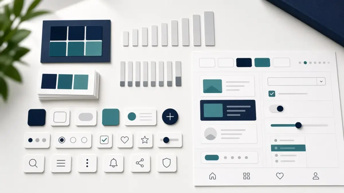
A Figma file full of components is not a system until it changes how a team decides. Here is the difference, and how we build something people actually use.
We will review your site or campaign and build a clear plan for the next step.